
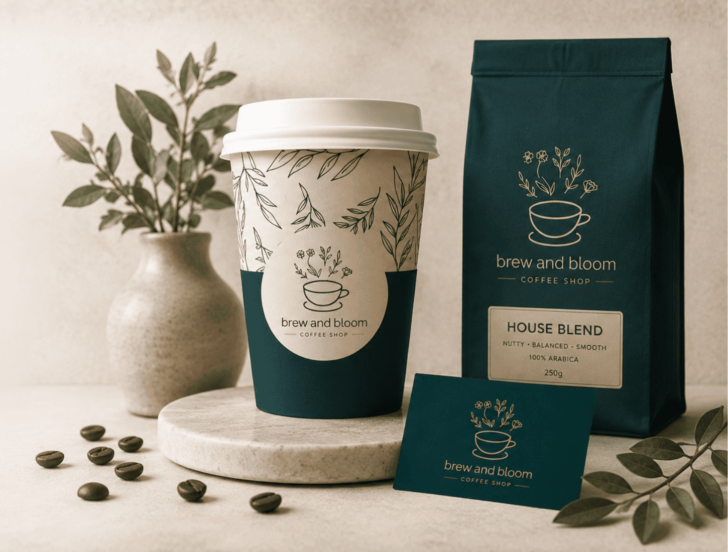
A warm, crafted brand built to be remembered.
Brew and Bloom Coffee needed more than an attractive logo or a standalone website. The business needed a complete visual system that could carry the same warmth, care and sense of craft across every customer touchpoint.
The Challenge
Brew and Bloom Coffee had a clear sense of craft and a loyal following, but the brand and website did not yet reflect the quality, warmth and personality of the product or the people behind it.
For a product-based business, the first purchase often begins long before someone tastes what is being sold. The packaging, website, imagery and overall tone all shape whether the brand feels trustworthy, considered and worth exploring.
The challenge was to create a visual identity that felt premium without becoming overly polished or distant, while giving the business a flexible foundation for future packaging, social media, print and digital use.
The Strategy
The brand identity and website were approached as one connected project rather than two separate deliverables.
That meant every decision—from colour and typography to page structure and image treatment—needed to support the same brand story.
The direction centred on warmth, craft and approachable quality. The identity needed to feel distinctive enough to be remembered while still remaining flexible and easy to use across a growing range of customer touchpoints.
The goal was to create a brand that felt considered and premium, but still welcoming enough to feel like part of someone’s daily ritual.
The Solution
The visual identity was developed around a warm, crafted aesthetic that could translate naturally across both physical and digital applications.
Colour, typography and graphic elements were selected to feel refined without losing the human quality of the business. The system was designed to give Brew and Bloom a recognisable presence while allowing the product and photography to remain central.
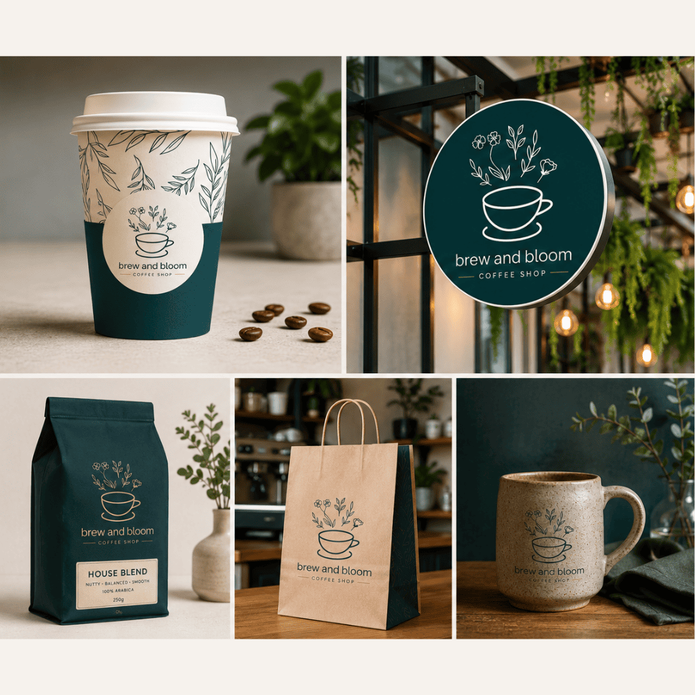
Brand guidelines documented how the identity should be applied across packaging, social media, print material and signage. This gave the business a practical framework for maintaining consistency as it grows.
The website was then built directly from that identity. Its structure, spacing, imagery and calls to action were designed to feel like a natural extension of the brand rather than a separate digital layer.
The project included
- Primary and supporting brand marks
- Brand colour palette and typography system
- Brand guidelines for future use
- Packaging and label applications
- Social media design direction
- Custom WordPress website design
- Responsive desktop, tablet and mobile layouts
- Clear product and business storytelling
- Consistent visual application across print and digital
The Result
- A cohesive brand identity and website delivered as one integrated system.
- A visual direction that communicates warmth, craft and approachable quality.
- A brand system that can be applied consistently across digital, packaging and print.
- A more professional and memorable presentation of the business.
- A flexible foundation designed to support future products, campaigns and business growth.
Project Visuals
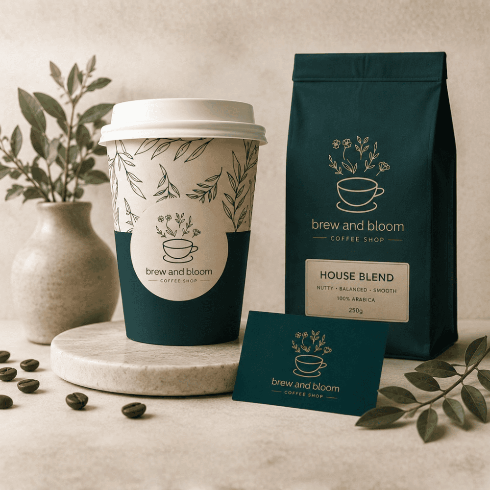
The identity was applied across packaging, digital content, brand documentation and website materials to demonstrate how the system could remain consistent across very different formats.


Ready to begin?
Let’s create something thoughtful for your business.
Book a complimentary call to talk through your goals and the support your business needs.