
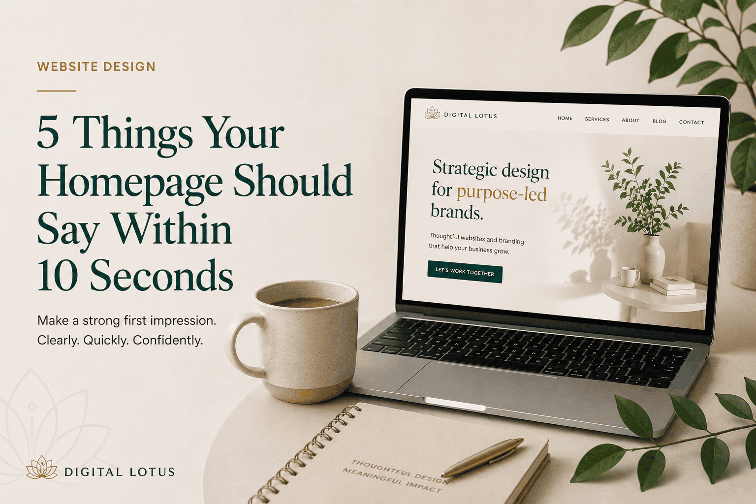
You’ve got a few seconds.
Someone lands on your website, takes a quick look around and decides whether to stay or hit the back button.
They’re not reading every word. They’re scanning. Looking for clues. Trying to work out whether they’re in the right place.
And if your homepage makes them work too hard to figure that out, chances are they won’t.
A beautiful website is great. But before anything else, your homepage needs to communicate.
Here are five things a visitor should understand within roughly 10 seconds of landing on yours.
1. Who you are
This sounds obvious, but it’s surprisingly easy to overlook.
Your visitor shouldn’t have to scroll halfway down the page or piece together vague headlines to understand who they’ve landed on.
Your branding, headline and opening copy should quickly establish your business and give them enough context to know where they are.
You don’t need to tell your entire story above the fold. You just need to remove the question:
“What is this?”
Clarity first. You can add personality from there.
2. What you actually do
One of the biggest homepage mistakes I see is copy that sounds lovely but doesn’t actually say anything.
Think:
Helping you step into your next chapter.
It might sound good. But what are you selling?
Coaching? Branding? Financial advice? A yoga retreat?
You can absolutely have creative, personality-filled copy. Just make sure it’s supported by something concrete.
If you’re a brand and web designer for small businesses, say so. If you make handmade ceramics, make that clear. If you offer virtual bookkeeping, your visitor shouldn’t need detective skills to figure it out.
Clear doesn’t have to mean boring.
3. Who it’s for
Once I know what you do, my next question is:
“Is this for me?”
Your homepage should give your ideal customer a reason to think yes.
That might happen through your headline, your imagery, the problems you mention or the way you describe your services.
Compare:
Web design for growing businesses.
with:
Thoughtful websites for independent businesses ready to look as established as they’ve become.
Both tell me what you offer. But the second begins to tell me who you understand.
You don’t have to appeal to everyone.
In fact, trying to usually makes your message weaker.
4. Why I should choose you
Your visitor probably has options.
So, once they understand what you offer, give them a reason to keep exploring your website.
This doesn’t mean plastering “WE’RE THE BEST!” across the homepage.
It means communicating what makes your approach different.
Maybe it’s your process. Your experience. Your point of view. The level of personal attention you offer. A particular specialism. The quality of your work.
And then, as they move further down the page, you can back that up with things like testimonials, results, case studies and examples of your work.
You don’t need to convince someone of everything in 10 seconds.
You just need to give them a reason to spend the next 30.
5. What I should do next
Finally, don’t make people guess where to go.
What’s the next step?
- View your services?
- Browse the collection?
- See your work?
- Book a consultation?
Your homepage should give visitors a clear path forward.
That doesn’t mean covering the page in buttons. In fact, too many competing calls to action can create exactly the problem you’re trying to avoid.
Decide what the most useful next step is and make it obvious.
The 10-second test
Open your homepage and imagine you know absolutely nothing about your business.
Better yet, show it to someone who genuinely doesn’t.
Give them 10 seconds, then close the page.
Ask them:
- What does this business do?
- Who do you think it’s for?
- What stood out?
- What would you click next?
If the answers are completely different from what you intended, you probably don’t need more on your homepage.
You need more clarity.
Because your homepage doesn’t need to tell visitors everything about your business in 10 seconds.
It just needs to tell them enough to make them want to stay.
Good design gets attention. Clear communication gives people a reason to keep it.