
What Is Included in a Brand Identity Package? (And What to Ask Before You Buy)
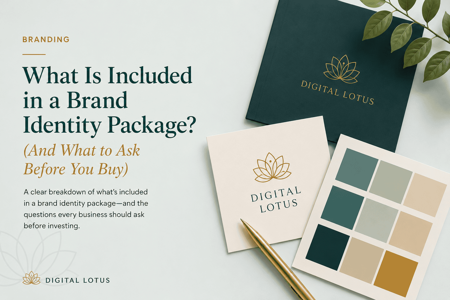
A brand identity package typically includes a logo suite, a colour palette, a typography system, and brand usage guidelines. What separates a solid package from a basic logo job is the thinking behind each element and the range of files the client actually walks away with.
Before getting into what is included, it is worth separating two terms that get used interchangeably but mean different things.
The difference between a logo and a brand identity
A logo is a visual mark. A brand identity is a system. The logo is one component of it. When a business owner says they need “branding,” they usually mean both, and a good designer will make sure that distinction is clear before quoting.
A logo alone does not tell anyone what font to use on the website, what colours go on packaging, or how the Instagram feed should feel. That is what the full identity system does. Without it, every designer or printer who touches the brand in future makes their own interpretation, and the result looks inconsistent.
What a proper brand identity package includes
Logo suite
Not just one version of the logo. A proper suite includes the primary logo, a secondary variation, and a standalone icon or monogram. Different contexts need different formats: a horizontal logo for a website header, a square icon for a social media profile photo, and a version that works in black and white for documents, stamps, and embossing.
Colour palette
Primary brand colours with their exact codes across formats: HEX for digital use, RGB for screen-based work, and CMYK for print. A thorough palette also specifies which colours function as backgrounds, which are accents, and which combinations to avoid.
Typography system
Which fonts to use, where, and at what weights. Typically a heading font, a body font, and sometimes an accent font for specific applications. The system includes guidance on sizing, line spacing, and hierarchy so the brand feels consistent in both a brochure and an email newsletter.
Brand usage guidelines
A document, usually a PDF, that explains how to use all of the above correctly. It covers where the logo should not be placed, which colour combinations are approved, minimum logo sizes, clear space requirements, and how the brand should feel across different applications.
What is often left out of cheaper packages
Some designers deliver a logo file and call it branding. If the quote does not mention guidelines, a colour palette with print codes, or multiple logo variations, it is worth asking specifically. It is not always a red flag, but the client should know exactly what they are buying.
File formats are another common omission. A PNG is the minimum. What is actually needed for long-term use includes AI or EPS vector source files, SVG for web use, PNG with a transparent background, and PDF. If only a PNG is provided, every future application of the logo will be a compromise.
Questions to ask before hiring a brand designer
- What file formats will be delivered?
- Are brand usage guidelines included?
- How many logo concepts will be presented?
- How many rounds of revisions are included?
- Who owns the final files: the client or the designer?
That last question carries more weight than most clients realise. Some designers retain source files and charge for any future amendments. The original working files should be part of what is handed over at the end of the project, not held as leverage for ongoing work.
When is the right time to invest in a full brand identity?
If the business is in its first few weeks and the priority is simply getting something live, a logo is a reasonable first step. Just make sure the files received are in a vector format so they can be properly extended later.
If the business is established, scaling, or about to go through a significant change such as a new market, new offering, or new pricing tier, a full brand identity is the right investment. It creates the visual foundation everything else builds on, including the website, pitch deck, and social media presence.
If the current brand is working well enough and leads are coming in, the budget is better spent on the channel that is actually underperforming.
A practical test
Ask someone who encounters the business across two or three different channels whether it looks like the same company each time. If the website feels like it belongs to a different business than the business cards, that gap is exactly what brand identity is built to close.